New Enews Looks Sharp, Scales to Your Device
02.06.15 · Sonia Greteman
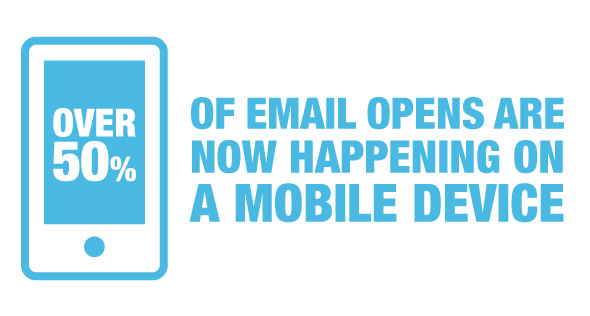
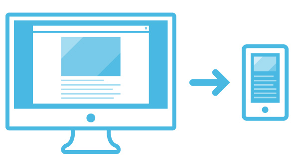
You check your email on the go. More than 50 percent of the population does. So we made our quarterly enews easier to read using responsive design. Here’s a look at the steps we took to improve how we deliver our insights to your inbox. Could it be time to revamp your own enews with a mobile-friendly, responsive email template?
We’ve been warning clients for years about the approaching mobile tsunami and last year that wave hit. We did our best to prepare, converting our own online presence to a responsive website several years back, but even we were amazed at the level of mobile domination. It became most apparent when we set out to create our next enews. 
Analytics Don’t Lie
One look at our email analytics and we knew it was time to change things up. Mobile device open rates rose dramatically compared to the previous year. We also noticed that our click through rates went up each time we included a video link.
Areas that weren’t performing as well: content at the bottom of the email and content that didn’t link to more information. This told us we needed to place vital content at the top and include links to drive traffic back to our blog.
Sharing, Reading, Engaging
Our email analytics also revealed that we weren’t growing our email list at the pace we wanted. We decided the best way was to simply ask people to sign up.
We developed a sign-up landing page that we can drive traffic to from channels such as email, social, and digital ads. It includes a form built specifically for one call to action: sign up for our email newsletter. That allows us to accurately measure how many new email addresses we capture using campaign-style tactics.
Increasing email sign-ups requires equal parts work and strategy. The key to success is providing your audience with multiple sign-up opportunities. We settled on five tactics.
- Slideup box that slides up from the right-hand corner of a blog post when a new visitor scrolls down to read more. We store a cookie preventing the slideup from showing again for 30 days.
- Sponsored content on LinkedIn that drives traffic back to the custom email sign-up landing page.
- Feature box on the home page encouraging first-time visitors to check out the blog and sign-up for the newsletter. We add a cookie so that it only shows on the first visit.
- Connect our email platform to our Facebook page through an email sign-up app.
- Use Qzzr to create an aviation-related quiz that also links to our email sign-up landing page.
When it came time to develop content for our newsletter, the first thing we looked at was a new content strategy. In the past we put together our email newsletters like we would a quarterly publication. With so many people now viewing our enews on mobile devices, we wanted a format that would help us get out timely news more frequently.
Our new approach relies on a “one source for content” approach. All this means is that before a piece of content goes into an enews issue it is also published on our website or blog.
Write for the Reader Sounds simple, but there are actually some best-practice steps we follow when publishing our best stuff on the web. We knew we wanted to drive more traffic to the blog and that meant optimizing our articles for search engines. Yes, SEO still works if you’re writing your content correctly. When writing, think about topics your audience would be interested in and how they might search for it.
How-to-guides, best tips and industry-specific topics tend to perform well. Think about what someone would search to find your article and sprinkle in some of that language. Don’t go overboard. We’re not talking about keyword stuffing here; but about incorporating relevant words and phrases so that your article shows up in search results.
Updated Design
In addition to making our enews responsive, we also incorporated some style changes to improve the overall user experience. Larger fonts improve readability, subsections define content types and a new masthead draws attention to our publication’s new name, Velocity.
Time to Send
Here’s an overall summary of what we did.
- Migrated to a responsive design making it easier for you to read on any device.
- Placed our most important information at the top.
- Provided links to more information on our website and blog.
- Wrote interesting content easily found by search engines.
- Prominently featured social sharing and newsletter sign up on our blog page.
All that’s left to do now is send, right? Not quite. The best email newsletters are those you continue to refine. We write alternate subject lines and do AB testing to see which version performs better. We then take those lessons learned and use them to increase future open rates. We also thoroughly review our analytics, measure our sign-up rates and evaluate our distribution frequency long before we start working on our next issue.

