Know Your Creative Lingo
07.06.17 · Greteman Group
Every industry has its terms and acronyms. And if you don’t use them right, things can go wrong. You don’t say VFR when you mean IFR. Or altitude when you mean attitude. Language matters. A lot.
When you work with a marketing agency such as Greteman Group, no planes fall from the sky if you misuse the term “font” when you really mean “typeface” or “DPI” when you meant “PPI.” But you could miss deadlines or rack up expenses from extra rounds of revisions. It saves time and money when both sides communicate correctly. Here are some terms we often hear misused. (Not that YOU would ever do that.)
Be very clear when working with a designer if you prefer a wordmark for your logo.
- Logo – A logo is a graphic element used to identify a company, business, organization or an individual. Design for logos run the gamut from the simple styling of a name to a configuration of artistic elements. Usually the simpler, the better.
- Wordmark – The design relies solely on the name, which is represented by distinct text-only typography. All wordmarks are logos, but not all logos are wordmarks. FlightSafety International is an example of a wordmark.
Both wireframes and protypes serve roles within website development.
- Wireframe – This basic, big-picture tool provides value early in a digital project’s design phase. Think of a wireframe as you would a blueprint, visual in nature, allowing a project to be plotted and sketched. This non-interactive concepting begins the dialogue of the preferred direction and vision to avoid costly changes later on.
- Prototype – This advanced, interactive phase of a website design maps out the user interface (UI). Much more detailed than a wireframe, the prototype allows you to better understand functionality and design choices before dollars and time are spent on coding.
It’s a federal crime to use a registered trademark symbol without first registering it. Avoid fees or jail time by knowing the difference between trademark and registered symbols.
- Trademark™ – If no trademark application is filed or pending, adding ™ simply establishes the owner’s common-law rights even without registration. The trademark symbol can also be used to denote that a state or federal registration application has been granted, or is pending.
- Registered® – This valuable symbol communicates that the owner has registered the preceding word or symbol with the U.S. Patent and Trademark Office. We visit the https://www.uspto.gov website often to ensure we stay on the right side of the legal process. A place we always want to be.
Think of these in simple terms: a font is what you use; a typeface is what you see.
- Typeface – A family of elements that display specific typestyle design. What most people mistakenly refer to as a “font” is actually a typeface. All those times you declared your devotion to the classic lines of Times New Roman as your “favorite font,” you actually meant “favorite typeface.”
- Font – A specific size and weight of a typeface. In the phrase, “10-point, bold Times New Roman,” 10-point and bold refers to the specifics of the font – or the production of – the typeface Times New Roman.
Resolution quality in print and electronic formats are measured by dots or pixels per inch.
- DPI – To achieve a sharp printed image, 300 dots per inch is the typical standard. Meet stated specifications or the production house will shrink or enlarge your design, affecting your finished product. Typically, the higher the DPI, the better the tonal quality and more accurate the color.
- PPI – Pixels per inch determine the sharpness of a digital image on a computer monitor or TV screen. Standard usage for web images is 72 PPI. If you have too few pixels per inch you’ll see jagged edges and perhaps even the large, individual pixels. Not good.
If you’re needing to modify creative, don’t send an EPS. Instead, send as an AI file.

- EPS – No one ever says, “Send me an ‘Encapsulated PostScript’ file.” It’s a mouthful. Just remember, an EPS file has compressed vector images that cannot be edited once saved as a JPG, PNG or GIF. An EPS can contain both text and graphics and almost always include a preview image for onscreen display.
- AI – Adobe Illustrator file formats contain uncompressed content that is editable. Photoshop, Microsoft Word, TIFF, JPEG and many other formats can be opened or placed in AI. It represents single-page, vector-based drawings in relatively small file sizes.
Choose the right file format to ensure the image renders correctly.

- Vector – Both EPS and AI are vector files. Vector graphics are made up of hundreds of thousands of paths (lines and curves). Digital images are created through a sequence of commands that place shapes in a two- or three-dimensional space. A huge benefit of vector files: they can be sized and scaled endlessly without losing resolution. Note, a vector image will always look smooth (non-pixelated) no matter how closely you zoom in. Text is a common vector image.
- Raster – Raster graphic images use a dot matrix of points of color, or pixels. Together, they form what’s frequently called bitmap images. Look at them closely, especially around the edges, and you can see square outlines of each pixel. Raster files are often larger than vector files as they can have high dots per inch (DPI).

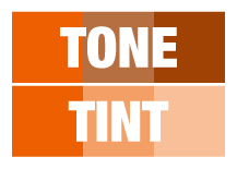
When you want to adjust a color, saying tint or tone can lead you down different paths.
- Tint – A tint is a lighter color of a hue, created by adding white. Just make sure a lighter version is what you’re after – and not a completely different color – so there’s not time lost on a miscommunicated request.
- Tone – You know the saying, “Tone it down.” The addition of gray deepens, or darkens a color. The hue remains unchanged. Just the chroma, or colorfulness shifts.
Thanks for taking a moment to make sure you’re using these common creative terms correctly. Meanwhile, we’ll return the favor by knowing a spoiler from an aileron.
