Building a Better Website with FlightSafety International
07.05.18 · Stephanie Stover
If a website’s several years old, chances are it’s time for an update. Older than that? Start with a clean sheet and reimagine the entire site. Ask key questions: How does the user now interact with your site? What action needs to happen quickly? How should multiple, interconnected databases work for the user’s ease and keep data flowing to the right areas seamlessly behind the scenes. If your site has years of backend updates and upgrades; and navigation that has grown unwieldy, we feel your pain. It happens to the best companies. Time for a fresh approach.
A Collaborative Process for A Successful Outcome
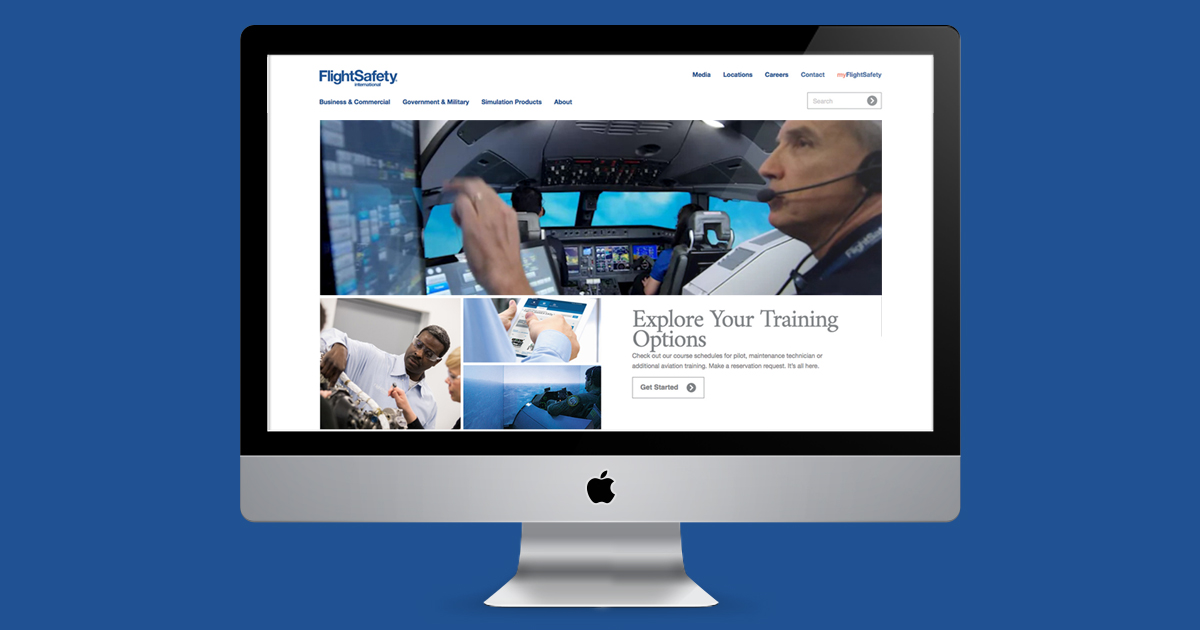
FlightSafety recently launched a reimagined site. We’re proud of what its team accomplished and the role we played. Working with stakeholders around the globe, we translated recommendations into a working prototype in our custom-developed, content management system, SmartParts. This open and intuitive CMS enabled both Greteman Group and FlightSafety to navigate the wireframe as if the site were already developed. You could see how it functioned on desktop, tablet and iPad – and on different platforms such as Apple and Android. This let us assess the user experience early and throughout the process – not just prior to launch. Basecamp served as our collaborative project management tool, enabling input throughout the process on everything from information hierarchy to micro-interactions.
Appealing to Professionals On the Go
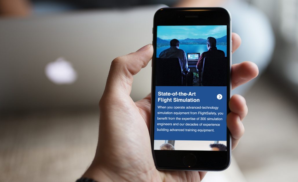
Responsive design means the site works beautifully across multiple platforms, especially important for FlightSafety’s highly mobile audience. A simplified menu structure and navigation make pathways clear. A clean, modern look feels fresh. Rich content with good information hierarchy keeps pages from looking cluttered and puts important information front and center.

Dynamic, User-Friendly Sites Require Easy Updates
One example of creating a better experience for both the customer and FlightSafety’s team is the Information and Resource Center, a repository of marketing materials. We integrated brochures by pulling them directly into WordPress. Moving forward, now all content updates can be made directly in the CMS, saving time and money. SEO keyword analysis and supporting tactics increase search visibility across the site and – along with a true search function – help people find what they need. Quickly.
