Your Message Is Important, So Tweet it Right

In general, the aviation community makes less use of social media than other groups. But just one quick search through Twitter, Facebook or Instagram demonstrates a healthy and ongoing online aviation conversation.

For those who haven’t paid much attention, Twitter might seem like just a place where people gossip about their personal trivia: where they are, where they’re going, what they ate today. But that was so five years ago – if it was ever completely true.

Today, Twitter serves as a powerful medium to exchange useful information, and to broadcast your message to an audience that’s actually looking for it, and eager to receive it. If you haven’t started Tweeting already, consider your next aviation trade show. You’ll be amazed how much richer and well-informed your experience will be if you follow along – and contribute to – the ongoing show dialogue.

Here are a few guidelines to get you going.

DoDon't-01

  1. Include #bizav when you want to be part of a broader conversation.
  2. Tweet often. Use your judgment. Once a month won’t be effective. Too many can be annoying.
  3. Find people with interesting tweets and follow them.
  4. Use MT for modified tweet if you need to edit a retweet so you can add your company handle.
  5. Proofread. It’s easy to make mistakes typing with thumbs. Be professional.
  6. Search a hashtag before using. Make sure you won’t be tangled up in an inappropriate conversation.
  7. Capitalize the first letter of multiword hashtags (i.e. PerformanceVector). It’s easier to read that way.
  8. Save room for images with your hashtags to maximize views.
  9. Find an event-specific hashtag such as #HAI_EXPO15 so your tweets join the overall conversation.
  10. Make connections. Retweet, exchange messages, extend compliments when they’re due.

DoDon't-02

  1. Make your hashtag too long, because #ThisIsReallyHardToReadAndPointless.
  2. Include symbols in hashtag (i.e. ampersand or plus sign). Hashtags only read letters.
  3. Hashtag your brand name. Instead, use something relevant and interesting that others will want to join.
  4. Use too many hashtags. At a minimum, you should have more message than hashtags.
  5. Feel obligated to use a hashtag. If it’s not intended to be part of a larger conversation, don’t hashtag it.
  6. Use generic hashtags. Your messages will get lost in a sea of unconnected noise.
  7. Pitch sales all the time. Focus instead on news, tips – anything your audience would find useful.
  8. SHOUT. It’s not polite to use all caps. Plus, most people will quickly tune you out.
  9. Say anything you wouldn’t want to see in traditional media. Because if you do, it just might be.
  10. Be careful when creating a hashtag. It’s easy to combine words that convey an unintended meaning.

DAI-Tweet

This column ran in the February 26 issue of BlueSky Business Aviation News.


WBJ; Working the Room

New Exploration Place traveling exhibit

Exploration Place held its VIP opening Jan. 23 for the new national traveling exhibit Wildlife Rescue.

2. From left: Deanna Harms, Greteman Group; Phil Frick, Judy Frick and Susan Skibba, Exploration Place. Photo courtesy of Exploration Place.

© Wichita Business Journal, 2015


Boosting Brains and Igniting Imaginations

Here in the Air Capital, we keep our eyes to the skies. And we do what we can to help deserving stars shine even brighter. We recently chose Sedgwick County’s much-loved science and discovery center, Exploration Place, for pro bono support.

Not only is Exploration Place celebrating its 15th anniversary, plans are underway for a new Design Build Fly exhibit. Its statewide leadership in science, technology, engineering and math (STEM) education has never been greater. Or more needed for workforce development.

What happens at Exploration Place is practically magical. So we conjured up some enchantment of our own and named it Launch a Learner. Our designers, writers and programmers created an interactive site that lets you discover little gems about Exploration Place and its mind-opening, possibility-generating activities.

Launch a Learner playfully communicates a serious mission. We need smart, educated people who can make things fly. By giving Exploration Place a boost, we elevate us all. Spurring innovation enriches all our tomorrows. Click and the fun begins. Share to launch more learners. We need them.

To visit Launch a Learner, click here.


New Enews Looks Sharp, Scales to Your Device

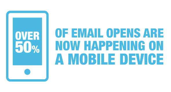
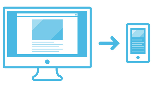
You check your email on the go. More than 50 percent of the population does. So we made our quarterly enews easier to read using responsive design. Here’s a look at the steps we took to improve how we deliver our insights to your inbox. Could it be time to revamp your own enews with a mobile-friendly, responsive email template?

We’ve been warning clients for years about the approaching mobile tsunami and last year that wave hit. We did our best to prepare, converting our own online presence to a responsive website several years back, but even we were amazed at the level of mobile domination. It became most apparent when we set out to create our next enews. VelocityBlogPost_02b

Analytics Don’t Lie

One look at our email analytics and we knew it was time to change things up. Mobile device open rates rose dramatically compared to the previous year. We also noticed that our click through rates went up each time we included a video link.

Areas that weren’t performing as well: content at the bottom of the email and content that didn’t link to more information. This told us we needed to place vital content at the top and include links to drive traffic back to our blog.

Sharing, Reading, Engaging

Our email analytics also revealed that we weren’t growing our email list at the pace we wanted. We decided the best way was to simply ask people to sign up.

We developed a sign-up landing page that we can drive traffic to from channels such as email, social, and digital ads. It includes a form built specifically for one call to action: sign up for our email newsletter. That allows us to accurately measure how many new email addresses we capture using campaign-style tactics.

Increasing email sign-ups requires equal parts work and strategy. The key to success is providing your audience with multiple sign-up opportunities. We settled on five tactics.

  • Slideup box that slides up from the right-hand corner of a blog post when a new visitor scrolls down to read more. We store a cookie preventing the slideup from showing again for 30 days.
  • Sponsored content on LinkedIn that drives traffic back to the custom email sign-up landing page.
  • Feature box on the home page encouraging first-time visitors to check out the blog and sign-up for the newsletter. We add a cookie so that it only shows on the first visit.
  • Connect our email platform to our Facebook page through an email sign-up app.
  • Use Qzzr to create an aviation-related quiz that also links to our email sign-up landing page.

velocityfeatimg Content for Mobile Viewing

When it came time to develop content for our newsletter, the first thing we looked at was a new content strategy. In the past we put together our email newsletters like we would a quarterly publication. With so many people now viewing our enews on mobile devices, we wanted a format that would help us get out timely news more frequently.

Our new approach relies on a “one source for content” approach. All this means is that before a piece of content goes into an enews issue it is also published on our website or blog.

Write for the Reader Sounds simple, but there are actually some best-practice steps we follow when publishing our best stuff on the web. We knew we wanted to drive more traffic to the blog and that meant optimizing our articles for search engines. Yes, SEO still works if you’re writing your content correctly. When writing, think about topics your audience would be interested in and how they might search for it.

How-to-guides, best tips and industry-specific topics tend to perform well. Think about what someone would search to find your article and sprinkle in some of that language. Don’t go overboard. We’re not talking about keyword stuffing here; but about incorporating relevant words and phrases so that your article shows up in search results.

Updated Design

In addition to making our enews responsive, we also incorporated some style changes to improve the overall user experience. Larger fonts improve readability, subsections define content types and a new masthead draws attention to our publication’s new name, Velocity.

Time to Send

Here’s an overall summary of what we did.

  • Migrated to a responsive design making it easier for you to read on any device.
  • Placed our most important information at the top.
  • Provided links to more information on our website and blog.
  • Wrote interesting content easily found by search engines.
  • Prominently featured social sharing and newsletter sign up on our blog page.

All that’s left to do now is send, right? Not quite. The best email newsletters are those you continue to refine. We write alternate subject lines and do AB testing to see which version performs better. We then take those lessons learned and use them to increase future open rates. We also thoroughly review our analytics, measure our sign-up rates and evaluate our distribution frequency long before we start working on our next issue.


Signature TailWins: A Bold Rebranding and a Mobile-Friendly UX

TW_08
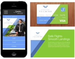
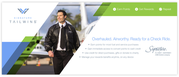
The new Signature Loyalty program is designed to be user and mobile friendly.

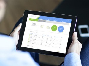
Everybody loves a little reward now and then. Pilots are no exception. Signature Flight Support® revamped its Signature TailWins® program, which provides valuable incentives for flight crews who use the company’s global FBO network. This required more than just a fresh color palette. The goal was to make the program easy to use, and effortless to claim rewards. We created an all-new, simplified web user experience, including an elegant, intuitive website that works anywhere, on any device. Instant access to current totals. Easy navigation. Powerful yet uncomplicated management options. And a full range of launch materials blew wind into the TailWins’ sails. unnamed

By all accounts, Signature TailWins® was a winner.

But flight support is a highly competitive business, and every major Signature Flight Support® competitor has its own pilot rewards program. Signature constantly searches for strategies to keep its services and programs at the head of the pack.

To generate renewed interest in TailWins, Signature greatly simplified the system, then recruited our help to design and promote a website that makes the new system work.

To make it compelling, we extended the TailWins brand with authentic photography, bold graphics and fresh energy, and created a modern, versatile, responsive web site that works on all platforms and devices.

TW_05
Signature promotes its rebranded TailWins with materials at each of its U.S. locations.

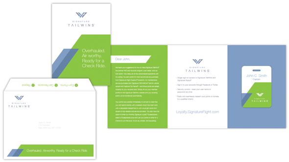
A full complement of compelling advertising, teaser emails and booth graphics, helped Signature launch the new TailWins at the annual Schedulers and Dispatchers Conference. With a welcome kit, counter and rack cards, a series of informative emails and more, Signature had a brisk breeze of smart strategy and irresistible creative at its back to guarantee a successful launch.

TW_06
A welcome kit leads both new and existing TailWins members directly to the Signature Loyalty signup page.